Mother Russia’s Quilt
In case it has escaped your notice, we are now in the final week of the 2014 Sochi Winter Olympics. And, as with all Olympics, LAW Creative has taken a particular interest on how it has been styled as well as performed.
When introduced in 2010, The London 2012 logo met with a very mixed reaction. It was pretty spikey, brash, very cool Britannia and had many people amazed at its simplicity and juvenility. No other city could have got away with it. The rest of the world expected a quirky, silly logo to go with a quirky, silly Olympic games, but, like the Games themselves the logo and graphics were a major success.
![]() In comparison, the Sochi 2014 logo is so Olympic it should win a Gold. I know Russia prides itself on its conservatism (ironically), but even for them it’s a bit safe.
In comparison, the Sochi 2014 logo is so Olympic it should win a Gold. I know Russia prides itself on its conservatism (ironically), but even for them it’s a bit safe.
A general consensus taken around the LAW Creative office agrees that it is built around a solid typeface (that’s Russia – tick), prominent Olympic rings (that’s because it’s the Olympics – tick) alongside a blue and white colour palette (that’s because it’s snowy – tick). Also the strap line ‘hot, cool, yours’ may sound a great wordplay in Russian but it is a little bit silly.
But ignoring the logo itself – it’s the supporting graphics which I love. It’s as if, in a moment of madness the designers broke free of their shackles, mixed Absinthe with their Voddy and have been let loose with a paintbrush in a Jumble Sale.
The official Sochi Manifesto is:
“Drawing on traditional craft and folk design elements from across Russia, combining them into a patchwork motif that is visually rich, stimulating and intriguing”
– if you ask me it’s a hallucinogenic mix of grandmas quilt, 80’s shell suits and campness that wouldn’t look out of place in a row of tents.
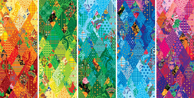
Of course these wild patterns are adorning the bodies of well-honed athletes who would still look good in a shell suit, but the sight screens and scoreboards and tickets and crash barriers are all covered in this wonderful pattern bringing a boldness and kaleidoscope of colours to a bleak, white canvas.
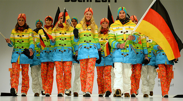
The teams have got caught up in this madness too. The German team have rediscovered the joys of combining snow wash denim with luminous ski coats and have embraced the pattern, covering themselves in it (they’re not all steel spectacles and Boss suits), and have you seen the Norwegian Curling teams trousers? Team GB has a dash of it, and USA have it all over (albeit in muted tones, missing the point slightly.)
It’s too early to say if these games have been a success, but the opinion at LAW Creative is that the sheer vibrancy has won through. I can’t wait to see what the Brazilians have come up with for 2016, blimey, just imagine…