Amazing tech or “seen it before” bore?

As the Head of Digital here at LAW Creative you’d probably expect me to be the sort of person who is obsessed with new tech and cutting edge gadgetry. The sort of person who would be found buried in the queue outside Regent Street’s Apple store last week trembling with baited excitement at the release of the new iPhone 5.
Well, yes and no. I am very much that person except I tend to purposely arrive late to the party when it comes to new tech. I have never been an early adopter and prefer for new products to evolve to a second, or third, generation before I make that leap and commit to the brand. However, in its fifth (or strictly 6th) iteration, I find myself sat in LAW HQ with a sparkly new iPhone 5 in my hand only hours after its global release.
So is this new device the greatest thing since sliced bread? Here are my initial thoughts.
Don’t forget the box
If you are looking for a proper hard core review of Apple’s new iPhone then you’ll be upset to hear that I’m not going to do that.
First off… the box. I expect by now there’ll be a thousand blog posts about the new iPhone out there, however how many will actually start at the beginning of the “consumer product experience”? As a marketing agency we obsess ourselves with the greatest level of detail and design finesse; design and form are always spearheading our creative processes. The first thing I always notice about Apple products is their packaging. It’s clean, crisp and succinct. Every square centimetre of space has been addressed and there’s virtually no waste; everything fits like an intricate 3D puzzle. This keeps the size down and makes Apple’s packing very tight and compact, a reflection of the technological loveliness hidden within. This isn’t just a fluke, Apple have taken time to design their packaging to make it part of the experience and it works – it feels like an extension of the product, a prologue to the main event. I have kept all the boxes for every Apple product I’ve ever purchased and I can’t say that for a lot of other tech I have purchased over the years.
In the hand
So once I’ve gotten over the warm feeling of opening a new Apple box I finally get to the prize – the new iPhone 5.
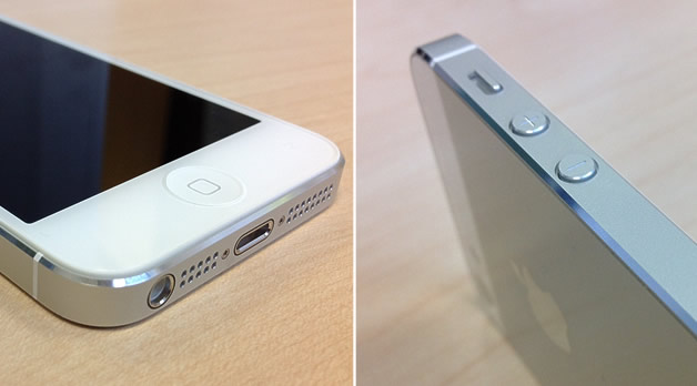
At first glance there are a few key things which Apple has adjusted. First of all the headphone jack has been moved to the bottom left of the device which gives a cleaner top edge, leaving just the power/lock button in its original position.
You may be thinking the bottom of the device must be cramped now with the jack, speakers/mike and charger port. Well for the uninitiated Apple has now adopted a new “Lightning” connector port which has replaced the old 30-pin interface. This is much smaller and so releases some real-estate along the bottom of the device. I, like a lot of techies out there, wondered why Apple didn’t adopt the pretty-much industry standard micro-usb interface for this rather than a proprietary connector, as that would have allowed for greater connectivity with other devices – although that’s probably exactly what Apple wants to avoid so that it can better manage its supported peripherals. This is likely to be annoying for consumers as we’ll all have to go and re-buy our docks and chargers and other devices, or at the very least purchase an ugly convertor. But, from a design point of view this does look a lot neater than the old 30-pin version and I even like the metallic opening surround.
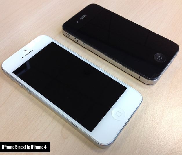
Once you have dug the phone out of the box you’ll notice that it is obviously lighter than its predecessors and thinner as well. The width hasn’t changed at all but the device is now “taller” adopting a larger 4inch screen at a true 16:9 aspect ratio. Oddly when I hold this against my old iPhone 4 I feel that it makes the 4 look stumpy and short, rather than the iPhone 5 appear longer (and therefore thinner). To me, it’s almost as if this new size is more natural and perhaps it is, due to the 16:9 ratio, or perhaps it’s because I’ve become subconsciously familiar with the other larger smart-phones on the market from Nokia, Samsung and htc.
The device also has some smaller design adjustments including polished, bevelled edges around the casing which seem to “glisten” as it catches the light and new machined holes on the bottom for the speaker and mike. This iteration seems to have an even greater attention to detail (not that Apple was ever lacking in this area) emparting a greater sense of quality and craftsmanship to the product.
Apart from these obvious adjustments to the form the new iPhone is otherwise unchanged from the iPhone 4 two generations before; the home button is still at the bottom, there is a front facing camera at the top and a standard rear-facing camera on the back. At a quick glance at one sat on a table you wouldn’t probably know it was a new phone.
Under the skin
I’ve only had about 4 hours to play with the new iPhone before starting to write this so my findings will be inconclusive at this stage but early opinion is… it’s fast, blazing fast! You can certainly feel the speed difference compared to my old iPhone 4 (and my older 3GS I had until only recently). The interface is very responsive and slick with no lag at all. The device doesn’t break a sweat even when opening up some of my more ‘labour-intensive’ apps such as SnapSeed or iMovie and that is due to its new powerful A6 CPU (a 32mn dual-core 1.2Ghz processor). The phone has 1GB RAM and coupled with the new processor makes it even more powerful than the new iPad with its A5X chip. Additionally, frame rates are better in some of the more graphics intensive games with a lack of jittering and stutter, making gaming a much more pleasurable experience.
The new iPhone 5 ships with the latest version of Apple’s mobile operating system iOS 6 which has a raft of improvements – and the odd step back (we’ll touch on this later). It’s the best version of the OS to date – fast, clean and simple – although this isn’t a huge jump from iOS 5, rather more a refining of existing applications and processes, a trimming-of-the-fat if you will.
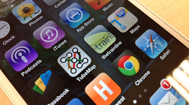
iTunes and App store have both had a face lift and seem quicker (when making searches) and easier to use for browsing apps and songs, making the whole user experience feel much more ‘complete’.
The camera software has been improved over the iPhone 4s with 8 megapixel camera on the rear (same as 4S) and a new 1.2 megapixel camera on the front. Taking photos was fast and easy with no lag – something I saw more of in older generations. There aren’t many new additions to the software except a new panoramic mode used to produce 240 degree panoramas should you so desire – quite a nice feature for those “Grand Canyon” shots.
Apple gets lost with their Maps
I’ve had to dedicate a section to this as for me, and probably a lot of people, the Maps app is the biggest let down on the new iPhone and possibly a deterrent away from the iPhone product-line for a select few.
In the lead up to the release and particularly on release day itself, the media was agog with articles and bulletins on Apples failure with their new Map app. Gone was the old Google Maps app with Apple’s own version “Maps” arriving in its place.
Now don’t get me wrong; Maps is fast, smooth and looks great, especially in 3D Flyover mode, and also provides turn-by-turn navigation (powered by Tom-Tom) which GMaps lacked, but for me it’s a real step backwards.
The core reason for this is data. Google has been in the “maps game” for 10 years or so now and has built up a phenomenally accurate database on which it runs its mapping services. Apple doesn’t have anything near this level of data sophistication which means a lot of locations are either in the wrong place or simply do not ‘exist’ at all.
I’m sure Apple will address this and the more people use the app the better it will become, but right now and for the foreseeable future it feels like we’ve lost something great – like Concorde or the space shuttle. I am left keeping my eyes on the App store for a stand-alone GMaps app…
Evolution not revolution
The new iPhone 5 is a fantastic device and Apple’s best iPhone to date. I have heard a lot of mixed opinion from the media and from friends, family and work colleagues. Some are disappointed that nothing has really changed, that the phone is ‘the same’ in looks and functionality. It’s not got that “wow” factor it once had. “What’s the point? It’s not gotten any better. Apple aren’t doing anything new.” I think they’re missing the point.
Let’s take the common car for example. Now that’s not really changed for over 100 years. We still have four wheels, four seats with one allocated to the driver, an engine at the front (generally) and some space for storage in the back. That formula has remained the same. It’s remained the same because it works.
In my mind Apple and its approach is very similar. It revolutionised the world with the original iPhone but since then it has taken that engineering masterpiece, now a design icon, and has evolved it, year on year, refining it, carefully adjusting it, nipping and tucking, planing down the rough edges to produce, what is now such an awesome device, something so good, that we almost take it for granted.
Evolution, not revolution is how you take something good and make it great and for me the new iPhone 5 is just that – something great. A true design icon of engineering master craftsmanship.


